
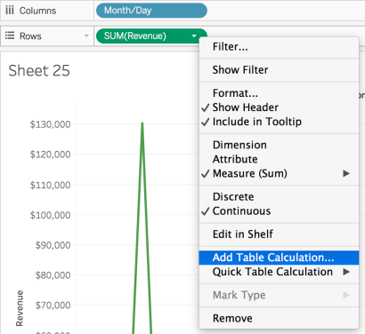
Line graph is simple, neat and one of the most popular charts that I use in my work. Today, I want to create a line graph to compare daily revenue with the same day last year. The challenge is that Tableau does not have Month/Day date format. See below:
I have been tried several ways. Now, I will show you the simplest way, which are only two steps.
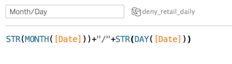
Step 1: Create a Month/Day field. This is actually not a date, but a string.
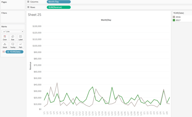
Step 2: Drag Month/Day to Columns shelf, and Revenue (anything you want to compare) to Rows shelf. Graph type should be Line. Then drag YEAR(Date) to Color.
It is basically done! Really simple huh?! This method also take care of 2/29/2016. You may see a gap between 2/28/2017 and 3/1/2017 because 2017 does not have 2/29. This is what we expect to see. Some people use Lookup function, which may have issue when we have different number of days between two years.

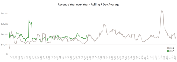
For this graph in my work, we show year over year average based on rolling 7 day average, which uses a table calculation. I will show you how to do it by two steps as well.
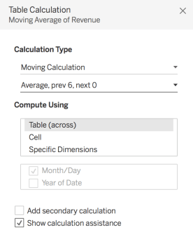
Step 1: Right click the field on Rows shelf, then select Add Table Calculation.
Step 2: The Calculation Type is Moving Calculation. Summarize values using Average. Previous values should be 6 and next values should be 0 because I need rolling 7 days. Compute using Table (across) based on Month/Day because Month/Day is on Columns shelf.
One more thing: by doing this, the line graph will show up until 6/26/2017 (Today is 6/21/2017) due to moving 7 days average table calculation.
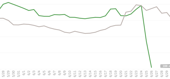
I would like to show data until yesterday (6/20/2017). We can use a Lookup function to control the end date.
Drag Lookup Date function to Filters shelf. Select True. Then the line graph will be:

Now, revenue year over year trend by rolling 7 day average is done!