
Based on different data structures, I will show you how to create a donut chart in two scenarios. Click here to download the interactive dashboard.
Scenario I: I would like to present revenue by product category. In the table, we have Product Category and Revenue fields.
Step 1: Under Marks, select the Pie mark type. Drag Product Category to Color. Drag Revenue to Size.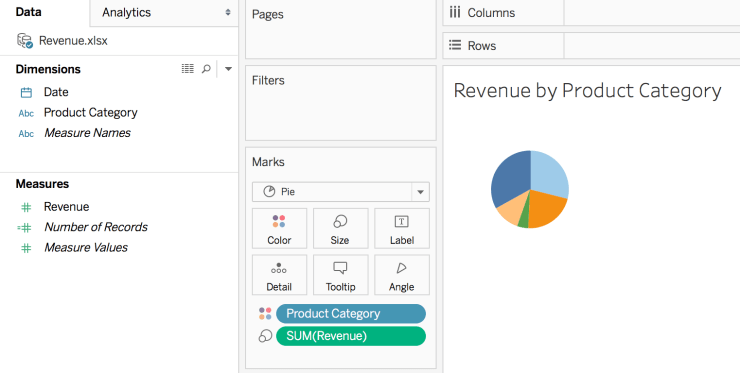
Step 2: Drag Number of Records to Rows twice. Right click both instances of Number of Records, and then select Measure(Sum) > Minimum.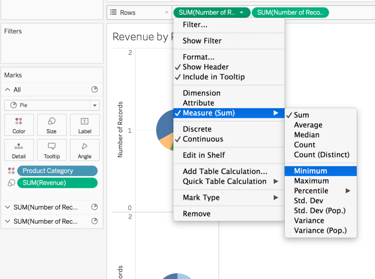
Step 3: On Rows, right click the second instance of Min(Number of Records), and then select Dual Axis.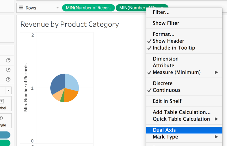
Step 4: Right click secondary axis, then select Synchronize Axis.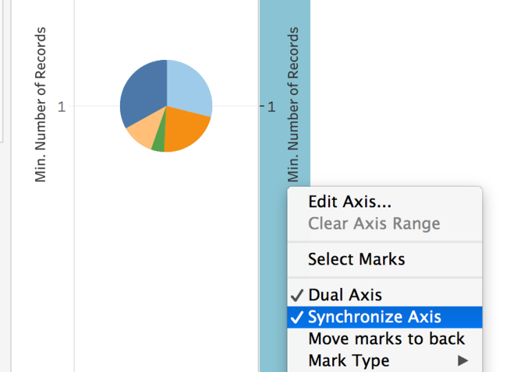
Step 5: At the bottom of the Marks card, click Min(Number of Records) (2). Remove Product Category from Color and remove Revenue from Size.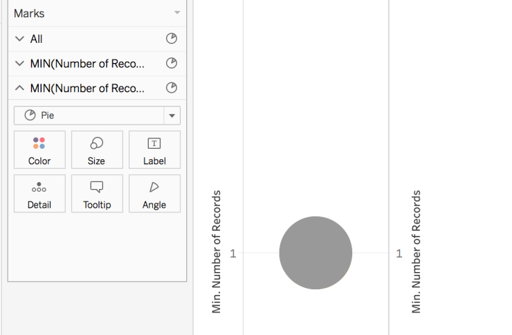
Step 6: Click Color, and then click white or same color as the background. Click Size, and then drag the slider to the left to make the circle smaller.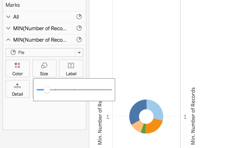
Step 7: Right click on each of the axes and uncheck Show Header. Right click the grid line in the middle of the chart, click format, then remove the row Grid Line. 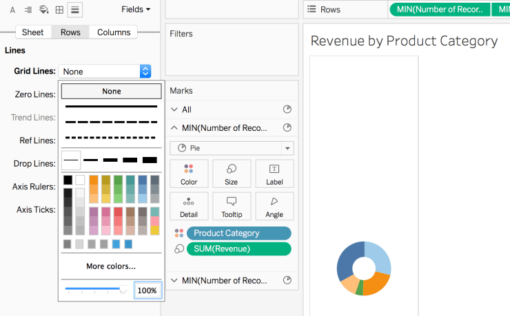
Step 8: Adjust the size of the donut chart, show label, and fit the chart in entire view. Also we can sort it by right click Product Category, then sort based on sum of the revenue descending.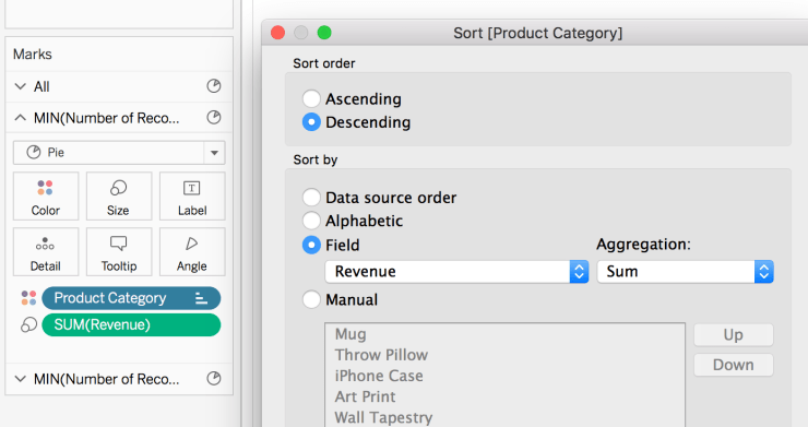
The donut chart is done! You can put other labels, such as product category, as needed.
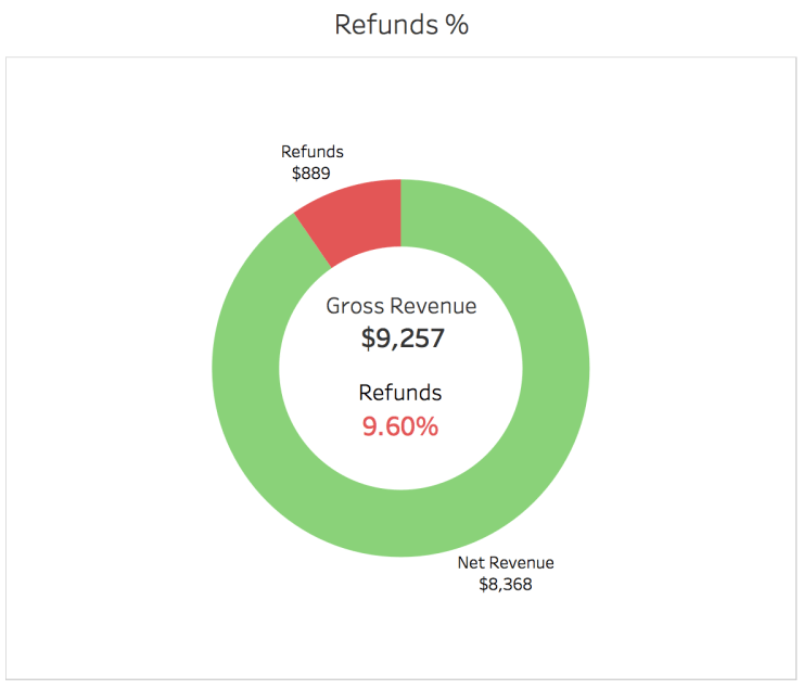
Scenario 2: I would like to present refunds % to gross revenue. Unlike the first scenario, we do not have a category. We have three fields: refunds, gross revenue and net revenue. I want to distinguish the color by refunds and net revenue. The steps are different, but the concept is the same.
Step 1: Drag Measure Names to Filters shelf. Only select Net Revenue and Refunds because they are what we want to present in the chart.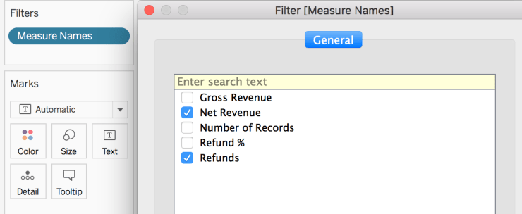
Step 2: Drag Measure Names to Color and Measure Values to Size. Select Marks as Pie. 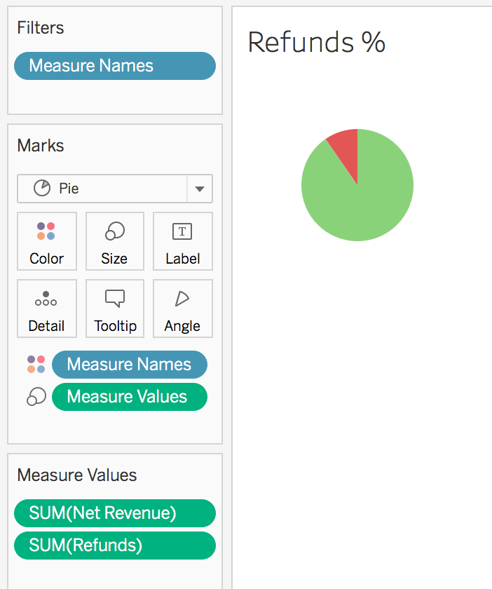
Step 3: Drag Number of Records twice to the Rows shelf. Right click both instances of Number of Records, and then select Measure(Sum) > Minimum.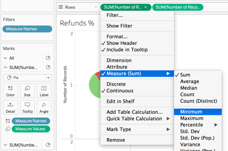
Step 4: On Rows, right click the second instance of Min(Number of Records), and then select Dual Axis. Right click the second instance of Min(Number of records) again, then select Synchronize Axis.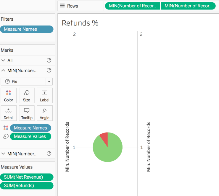
Step 5: At the bottom of the Marks card, click Min(Number of Records) (2). Remove Measure Names from Color and remove Measure Values from Size. 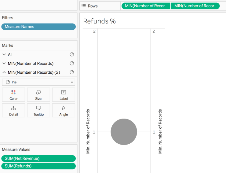
Step 6: Click Color, and then click white or same color as the background. Click Size, and then drag the slider to the left to make the circle smaller. Clean the chart like we did for scenario 1 step 7 and 8 to make it pretty. Also, add labels to make the chart more descriptive.
Note: if you want show the label inside the donut, then you need to drag the metrics under MIN(Number of Records)(2).
The Refunds % Donut Chart is done! You can also add other labels as necessary.