The company is going to launch 10 new stores. The capstone project has three main tasks: determine store format for existing stores, store format for new stores, and forecast produce sales for the existing stores and the new stores. The methodology involve segmentation and clustering, non-binary classification model, and time series forecasting. Tools used in this project are Alteryx and Tableau.
How to create a stacked bar chart that adds up to 100% in Tableau?
Bar char is probably one of the simplest charts that every data analyst uses all the time. It is simple but very effective. I am working on a web traffic report, which needs to compare website visits by device category (desktop, mobile and tablet) over time. I think a stacked bar chart could be applied …
Continue reading "How to create a stacked bar chart that adds up to 100% in Tableau?"
How to create a YoY line graph in Tableau?
Line graph is simple, neat and one of the most popular charts that I use in my work. Today, I want to create a line graph to compare daily revenue with the same day last year. The challenge is that Tableau does not have Month/Day date format. See below: I have been tried several ways. …
Continue reading "How to create a YoY line graph in Tableau?"
What I Learned at Tableau Conference 2025: Smarter, Faster, More Connected Analytics
Introduction I had the opportunity to attend Tableau Conference 2025, and it was packed with exciting announcements, inspiring sessions, and a clear vision for the future of analytics. In this post, I’m sharing key takeaways that stood out to me, from Tableau’s evolution into a smart assistant to technical upgrades in Tableau Prep, new visualization …
How to fix Tableau Email Subscription Failure?
Context I have a report with 40+ tabs. The email subscription failed. First, we increased the subscription timeout from 1,800 (default value) to 3,600 (seconds), which still failed. Then I increased subscription timeout from 3,600 to 7,200, but the subscription background job still failed at 3,600 seconds. The subscription timeout for background task was 3,600 …
Continue reading "How to fix Tableau Email Subscription Failure?"
What I Learned from Tableau Conference #Data23
Tableau Conference 2023 was held in Las Vegas from 5/9/23 - 5/11/23. I was so excited joining the conference this year after the pandemic. A lot of great features have been released or will be released soon. You may catch the highlights from Tableau Conference 2023 on Salesforce+.
How to String Agg a Dimension in Tableau?
Tableau does not have string_agg() function like SQL. I'd like to show list instead of asterisk when multiple values are present. Use Case: my company works with vendors to manufacture products. One product might be manufactured by different vendors . I'd like to show vendors associated with each product. If there are multiple vendors associated …
Continue reading "How to String Agg a Dimension in Tableau?"
Predictive Analytics – Project 5: A/B Test a New Menu Launch
Topic: A/B Test | Tool: Alteryx Project Overview: The coffee restaurant would like to conduct a market test with a new menu and needs to figure whether the new menu can drive enough sales to offset the cost of marketing the new menu. To minimize the risk, the management team decides to test the changes …
Continue reading "Predictive Analytics – Project 5: A/B Test a New Menu Launch"
Predictive Analytics – Project 4: Predicting Default Risk (Creditworthiness)
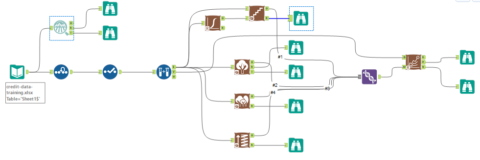
Topic: Classification Model | Tool: Alteryx Step 1: Business and Data Understanding What decisions need to be made? A small bank which typically get 200 loan applications per week and approved by hand suddenly received nearly 500 loan applications due to a financial scandal that hit a competitive bank last week. As a loan officer, …
Continue reading "Predictive Analytics – Project 4: Predicting Default Risk (Creditworthiness)"
Predictive Analytics – Project 3: Create an Analytical Dataset
Topic: Data Wrangling | Tool: Alteryx The Business Problem: Pawdicity is a pet store chain in Wyoming with 13 stores throughout the state. This year, Pawdacity is going to open the 14th store. Your manager asked you to perform an analysis to recommend the city for Pawdacity's nearest store based on the predicted yearly sales. …
Continue reading "Predictive Analytics – Project 3: Create an Analytical Dataset"
Predictive Analytics – Project 2: Predicting Catalog Demand
Topic: Predicting Catalog Demand | Tool: Alteryx Description: The project is to predict how much money the company can expect to earn from sending out a catalog to new customers. Need to build a linear regression model and apply the result to the mail-order catalog business problem. Step 1: Business and Data Understanding What decisions …
Continue reading "Predictive Analytics – Project 2: Predicting Catalog Demand"
Predictive Analytics – Project 1: Predicting Diamond Prices
Project Overview A jewelry company would like to put in a bid to purchase a large set of diamonds. In this project, I will use the results from a predictive model to make a recommendation on how much the jewelry company should bid for the diamond. Project Details A diamond distributor decided to exit the …
Continue reading "Predictive Analytics – Project 1: Predicting Diamond Prices"


